+

Morales Marketing — Brand & Graphic Design

We don’t just draw logos. We build brands.

A logo on its own doesn’t do much. What works is the whole set — the menu, the flyer, the card, the sign — all saying the same thing, so a business looks established from the first day.

Below are four concept brands, each designed as a complete working identity: its own colors, its own type, and every piece a real business needs. They are concept projects, built to show the work — the same set your business would get.

01 — Restaurant Brand

La Cosecha

Concept Project

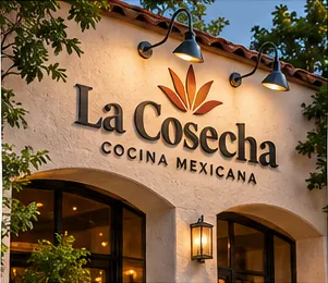
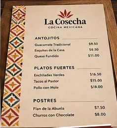
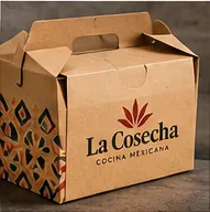
Rooted in tradition, made for today — a warm identity for a contemporary Mexican kitchen. La Cosecha pairs a distinctive agave-inspired mark with expressive serif typography; earthy color, clean layouts and meaningful details make the restaurant feel rooted in culture without becoming nostalgic or predictable. The symbol references harvest and hospitality, and the typography gives it a confident, established voice — every application stays recognizable, from the storefront sign to the takeout box.
Primary Logo La Cosecha — Primary Logo
Reversed Logo La Cosecha — Reversed Logo
Brick Red#79231F
Terracotta#D97428
Harvest Gold#EDA827
Agave Green#1B513B
Type · EB Garamond / Lato
La Cosecha — Primary Logo
La Cosecha — Reversed Logo
La Cosecha — The Symbol
La Cosecha — Storefront Signage
La Cosecha — Restaurant Menu
La Cosecha — Takeout Packaging
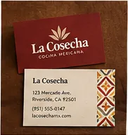
La Cosecha — Business Card
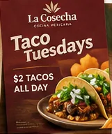
La Cosecha — Weekly Promotion
Colors
Brick Red#79231F
Terracotta#D97428
Harvest Gold#EDA827
Agave Green#1B513B
Type

EB Garamond — display & headlines

Lato — text & labels

02 — Coffee Shop Brand

Riverbend Coffee Co.

Concept Project

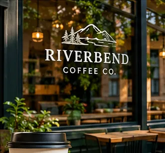
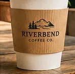
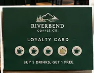
A little ritual, a lot of character — neighborhood coffee with a sense of place. Riverbend has the quiet confidence of a local favorite: a line-drawn mountain landscape, traditional serif lettering and natural colors evoke a welcoming space that customers want to return to. The understated landscape becomes a memorable signature, translating smoothly across the storefront window, takeaway cups, printed menus and the loyalty card.
Primary Logo Riverbend Coffee Co. — Primary Logo
Reversed Logo Riverbend Coffee Co. — Reversed Logo
Pine#174A35
Oat#E2D5BA
Caramel#BA8650
Roast#5B3B23
Type · EB Garamond / Lato
Riverbend Coffee Co. — Primary Logo
Riverbend Coffee Co. — Reversed Logo
Riverbend Coffee Co. — The Symbol
Riverbend Coffee Co. — Storefront Window
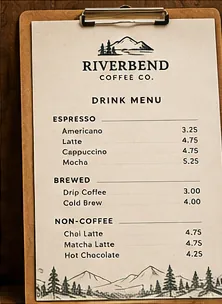
Riverbend Coffee Co. — Drink Menu
Riverbend Coffee Co. — Cup Sleeve
Riverbend Coffee Co. — Loyalty Card
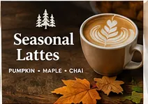
Riverbend Coffee Co. — Seasonal Promotion
Colors
Pine#174A35
Oat#E2D5BA
Caramel#BA8650
Roast#5B3B23
Type

EB Garamond — display & headlines

Lato — text & labels

03 — Construction Brand

Riverstone Construction

Concept Project

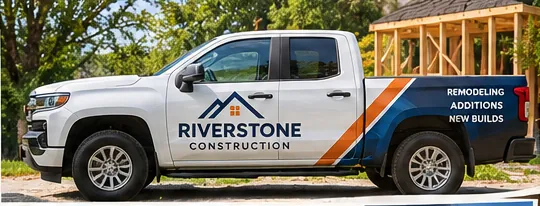
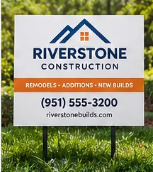
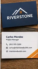
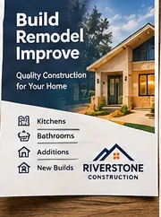
Solid work deserves a solid identity — a strong visual system built to be trusted. Riverstone is direct, bold and practical: a roofline monogram, sturdy sans-serif typography and a high-contrast navy-and-orange palette give this residential construction brand authority and curbside visibility. The roof mark signals the service immediately while staying distinctive enough for trucks, yard signs and stationery, and clear hierarchy keeps the brand practical in the field.
Primary Logo Riverstone Construction — Primary Logo
Reversed Logo Riverstone Construction — Reversed Logo
Deep Navy#103960
Safety Orange#EE6B24
Steel#60666B
Concrete#BEC3C7
Type · Lato Black / Lato
Riverstone Construction — Primary Logo
Riverstone Construction — Reversed Logo
Riverstone Construction — The Symbol
Riverstone Construction — Branded Work Truck
Riverstone Construction — Yard Sign
Riverstone Construction — Business Card
Riverstone Construction — Service Brochure
Colors
Deep Navy#103960
Safety Orange#EE6B24
Steel#60666B
Concrete#BEC3C7
Type

Lato Black — display

Lato — text & labels

04 — Community Organization Brand

Riverside Community Center

Concept Project

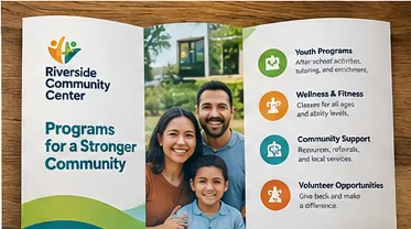
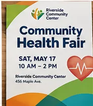
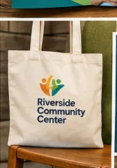
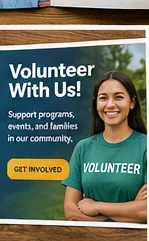
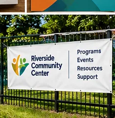
More connection, more possibility — an identity created to bring people together. Riverside Community Center uses energetic organic shapes and welcoming typography to communicate belonging, with flexible color and approachable graphic elements that support everything from program brochures to volunteer events. The emblem expresses people, movement and shared growth, and an accessible color system helps the organization stand out without sacrificing clarity in outreach materials and public signage.
Primary Logo Riverside Community Center — Primary Logo
Reversed Logo Riverside Community Center — Reversed Logo
Teal#158A93
Orange#ED7727
Sunshine#F0B015
Leaf Green#4F9835
Type · Lato Black / Lato
Riverside Community Center — Primary Logo
Riverside Community Center — Reversed Logo
Riverside Community Center — The Symbol
Riverside Community Center — Program Brochure
Riverside Community Center — Event Poster
Riverside Community Center — Canvas Tote
Riverside Community Center — Volunteer Poster
Riverside Community Center — Outdoor Banner
Colors
Teal#158A93
Orange#ED7727
Sunshine#F0B015
Leaf Green#4F9835
Type

Lato Black — display

Lato — text & labels

Brand & Graphic Design

Your business could look this established.

One call, and we talk through what your business needs — a full identity, or the pieces you’re missing. Every brand is designed by Hector Morales himself, in English, Spanish, or both.